
Tool version: OkurraSAR 2.02 · OkurraMMD 2.02 · OkurraSR 2.02 · OkurraOscillator 2.02 · OkurraGlobalATR 2.00 (+ global versions: OkurraGlobalSAR 2.02 · OkurraGlobalMMD 2.02 · OkurraGlobalSR 2.00 · OkurraGlobalOscillator 2.00) — release 2.05
A note on how the chapters are split. This chapter describes what the companion indicators show and how to use them in design work. What a given filter means for the strategy (when SAR “favors” a direction, how to read the MMD clouds, what an SR zone is) — that is chapter 10 (filters) and chapter 9 (the OKUR engine). Here you learn the picture; there — its meaning.
Table of Contents
6.1 Why companion indicators 6.2 Nine indicators — an overview 6.3 What each of them draws 6.4 Following the active button 6.5 Per-button and global versions on one chart 6.6 Auto-loading and cleanup 6.7 On the EA chart — the picture of the active strategy 6.8 Practice
6.1 Why companion indicators
The OkurraButton and OkurraGlobal panels let you set parameters. The companion indicators let you see them on price. This is the missing link of “designing while seeing”: you change the oscillator threshold or the filter parameters in the panel, click Apply — and these eight indicators (the ones you have loaded) immediately redraw on the chart exactly what the engine and the filters “see” with that configuration.
Each of them is drawing-only — it computes nothing “for trading purposes”, generates no signals, never touches the account. It shows a picture: the oscillator line, SAR dots, MMD clouds, SR zones. Thanks to that, before anything reaches the robot, you can judge visually whether the strategy “catches” the market where you want it to.
The companion indicators are free (chapter 3.2) — like all O!kurra indicators, panels included. A natural entry point into the ecosystem: you can use them purely to observe the methodology, even without an EA subscription.
Tool positioning. The companion indicators serve observation and learning — they show how the methodology looks on price. You work with them on a demo account, for research and educational purposes.
6.2 Nine indicators — an overview
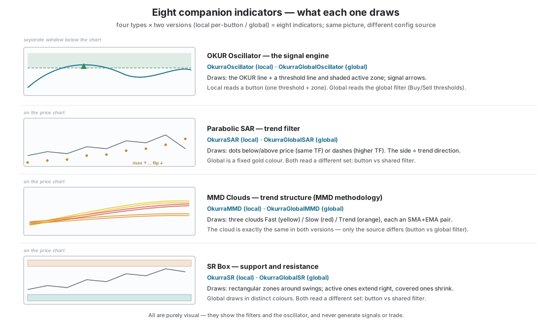
The indicators fall into five types. Four of them (oscillator + three filters) have two versions: a local one (shows the configuration of a single button) and a global one (shows the configuration of a global filter from OkurraGlobal). The fifth — the volatility-gate (ATR) window — exists in a global version only, because the gate is one for the whole EA (since release 2.03).
| Type | Local version (per-button) | Global version | What it shows |
|---|---|---|---|
| OKUR oscillator | OkurraOscillator | OkurraGlobalOscillator | OKUR oscillator line + threshold + zone |
| Parabolic SAR | OkurraSAR | OkurraGlobalSAR | SAR dots/lines (trend) |
| MMD Clouds | OkurraMMD | OkurraGlobalMMD | three clouds (Fast/Slow/Trend) = six averages |
| SR Box | OkurraSR | OkurraGlobalSR | support/resistance zones |
| Volatility gate (ATR) | — | OkurraGlobalATR | ATR in points + the gate’s floor and ceiling lines + bars with the gate closed (since 2.03) |
The local versions show what the active button in OkurraButton sees (section 6.4). The global versions show the global filters designed in OkurraGlobal — the shared ones the buttons subscribe to (chapters 5.5, 5.8). Both versions can be on the chart at the same time — they have different colors and do not overlap (section 6.5).
The oscillator (OKUR) and the volatility-gate (ATR) window draw in separate windows below the chart (like classic oscillators); the three filters (SAR, MMD, SR) draw directly on the price chart as overlays.
6.3 What each of them draws
Here we describe the picture — what you will see. What that picture means for the strategy is covered in chapters 9 (OKUR) and 10 (filters).
OkurraOscillator — the OKUR line (separate window).
In the window below the chart you see the OKUR oscillator line and a horizontal threshold line (Threshold) — the boundary of the button’s active zone. Optionally it also shows a “mirror” of the threshold (the opposite value, faded) as context, plus a second, dashed line (Band Exit) when you use the signal validity band. When the indicator follows a button (section 6.4), the background of the active zone is shaded (green for BUY, red for SELL), and a small ^ or v mark appears next to the threshold readout. That mark is not a BUY/SELL direction arrow — it only tells you on which side of the threshold the active zone lies (^ = zone above the threshold, v = below). You read the strategy direction from the shading color (green BUY / red SELL). Additionally, the line can show arrows at the spots where an entry signal would occur with the current configuration.
From release 2.05: the Zone Reach line. When the followed button has the far edge of the zone switched on — Zone Reach (chapter 9.4) — the window draws it as a horizontal dash-dot line. Next to the line, at the right edge of the window, stands its value — just like the threshold readout, in the color of the Reach line. The zone shading then reaches from the threshold only up to Reach, because beyond Reach there is no zone any more. You set the line’s color and width in the indicator’s options:
Zone Reach line color(ZoneReachColor, DodgerBlue by factory default) andZone Reach line width (px)(ZoneReachWidth, 1 by factory default).The window does not show what the robot switches off (from 2.05). At startup the robot switches off a Zone Reach set on the wrong side of the threshold (chapter 9.4) and a band whose Band Exit lies on the wrong side of the threshold (chapter 9.6). The window does the same. It draws neither such a Reach line (together with its value) nor such a Band Exit line, and it computes the arrows without the switched-off edge and without the switched-off band — just like the robot. Up to release 2.04 the window’s arrows counted such a band as switched on and could show different signals than the robot.
The global version draws differently. OkurraGlobalOscillator shows two threshold lines at once in the subwindow: the SELL threshold (orange-red, OrangeRed) and the BUY threshold (lime, Lime) — because the global OKUR filter has a separate zone for each direction. It also draws dashed “Reach” lines (the far edge of each zone; the line disappears when the zone is “open”, i.e. has no far edge) and the labels “Sell N” and “Buy N” at the right edge of the window. There is, however, no background shading, no signal arrows and no mirror line here — it is a calmer picture of just the boundaries of the global filter.
Two places, two sets of arrows — this is deliberate. Signals are visible in two places and they are not the same thing:
- The oscillator window shows arrows at raw OKUR signals — the entries the OKUR engine itself would generate, before the filters act. There are usually more of them. As of release 1.28 the arrows respect the extreme modes (chapter 9.5): in the One Per Visit / New Extreme / New Extreme + Keep modes the oscillator draws only the signals the EA could actually register (visibly rarer); in the Classic and Keep Across Exits modes the arrows stay fully raw — every trigger fulfillment draws.
- The arrows on the price chart itself are drawn by OkurraButton (not the oscillator) and show only the signals let through by the filters of the active button (SAR / MMD / SR / OKUR plus the global filters the button subscribes to). There are usually fewer of them.
Arrows on price: SELL above the candle (measured from its High), BUY below the candle (from its Low); the arrow’s distance from the candle is set by Chart_Arrow_Offset_Pts (in points, default 30). They are drawn from closed candles, so once placed an arrow does not repaint.
How many arrows in the window, how many signals in the robot - and why they are not the same. It is easy to assume the window shows what the robot sees, only before the filters, and that everything visible in the window but not on the price is what the filters cut off. That is not so, and it is worth knowing why, so you do not go looking for a fault where there is none. The window is a preview of the oscillator’s rhythm, not a record of the robot’s decisions. Three reasons it can show more:
- The robot forgets the tracked extreme only when it actually places an order. In Classic and Keep Across Exits the window never forgets it, because the oscillator alone cannot tell which signals the robot really registered. After an entry the robot measures the pullback from a new extreme while the window still measures it from the old one - and keeps drawing.
- With Signal Bar = Live the robot recomputes the oscillator on every tick of the forming candle, while the window only has finished candles. The two then see a different sequence of values. This cannot be evened out: past ticks are not in the chart history. The sub-window header says so directly - it shows
bar=Livewith that setting andbar=Closedwith the other.- The filters - this part of the original explanation is true, and it applies to comparing the window with the arrows on price.
There is a fourth cause as well: the pause after rollover (the change of day). For a set time after the daily reset hour the robot does not evaluate the button at all — it does not track the oscillator and gives no signals (Pause N min after daily reset,
DPL_PostRollover_DelayMinutes, 120 minutes by factory default from the reset at 00:00 broker time; chapter 14.7). The start and the end of the pause are visible in the robot’s log:[DPL Rollover] New day, … - trading paused for … more min.and[DPL Rollover] Post-rollover pause lifted, trading resumed.. The window has no such pause and evaluates every candle. So during the pause it may show arrows the robot does not have. On the first candle after the pause (around 02:00 broker time with the factory settings) the robot and the window may see different things — also the other way round: the robot has a signal and the window has no arrow.Measured in the tester (XAUUSD M1, 10–21 August 2026, Signal Bar = Closed, Extreme Mode Classic; the window’s arrows computed with the same code the indicator uses): a robot signal without an arrow in the window occurred on at most three candles, each time at 02:00, i.e. on the first candle after the pause — also in the settings without Zone Reach. Apart from those, every robot signal had its arrow in the window.
For a sense of scale: on a measured run (XAUUSD M1, 11 days) the window showed more than twice as many arrows as the robot had signals, with zero signals cut off by filters. In the sparse extreme modes it can go the other way - the window may show fewer, because it latches after the first signal.
The record of the robot’s decisions is the decision journal (chapter 22), not the window. The window is for something else, and at that it is good: it shows the oscillator’s rhythm on any chart, with or without a robot running.
Since release 2.03: the arrow sits on the candle where the robot ACTS. With Signal Bar = Closed the robot stands on one candle and reads the previous one - and the window used to draw the arrow on that previous candle, one candle too early. It now draws it where the robot makes its decision. The newest candle gets no arrow with this setting, because the candle the robot would act on has not opened yet. With Signal Bar = Live nothing changes - there the robot works on the current candle anyway.
OkurraSAR — Parabolic SAR (on the chart). SAR dots appear on the price chart when the SAR timeframe matches the chart timeframe. When SAR is computed on a higher timeframe than the chart, it draws short horizontal dashes (one per higher-timeframe candle), with gaps at the boundaries of the higher-timeframe candles — so that a SAR “jump” does not produce slanted connecting lines. Dots/dashes on one side of price mean one trend direction, on the other side — the opposite one (meaning: chapter 10).
OkurraMMD — MMD clouds (on the chart). The chart shows three MMD clouds: Fast (yellow), Slow (red) and Trend (orange). Each cloud is a pair of averages of the same period — an SMA and an EMA — drawn as two lines in the same color; the “cloud” is the space between them (the indicator does not fill it with color — it is simply a pair of lines). Together that makes six averages. The mutual arrangement of the three clouds (which one is above which) carries the interpretation of the MMD methodology (full description in chapter 10.4; full methodology — magiconcharts.com).
An MMD cloud is computed the same way for a button and for the global filter — the same three clouds (Fast/Slow/Trend), the same principle. They differ in colors so you can tell them apart on one chart: the button’s local version (OkurraMMD) draws yellow/red/orange, while the global version (OkurraGlobalMMD) draws Fast light blue (Aqua), Slow blue (DeepSkyBlue), Trend green (SpringGreen) (section 6.5).
Two-cloud mode (MMD 2-Cloud Mode). When you enable the MMD 2-Cloud Mode switch in the MMD filter configuration (chapter 10.4), the indicator draws only two clouds — Fast and Slow; the Trend cloud disappears from the chart. This is not cosmetics but a faithful reflection of the logic: in this mode the filter’s decision relies solely on the mutual arrangement of Fast and Slow, and the Trend cloud is ignored entirely — so the indicator does not show it. It works the same in the local version (OkurraMMD) and the global one (OkurraGlobalMMD).
OkurraSR — support/resistance zones (on the chart). Rectangular zones appear on the chart, built around significant highs and lows (swings) detected in price: resistance zones from local highs, support zones from local lows. Active zones extend to the right, 5 candles of the SR timeframe into the future (the SR_ShiftToRight setting, default 5) — so they do not stretch to infinity, they only stick out a bit past the current price; covered zones (broken through by price) shrink to the breakout candle — a visual sign that the level has been beaten.
Since release 2.03: these are exactly the zones the robot filters on. The overlay used to build them with its own code and differed from the robot in three small ways - it drew the newest, still-forming swing that the robot does not have; it had no limit on the number of zones; and in a borderline case it decided differently whether a zone was support or resistance. Both sides now build zones with the same code, so the picture and the decision are the same thing. Two effects you can see with the naked eye: the newest swing appears on the chart only once it is confirmed (the robot waits the same way - while the candle is still forming there is nothing to build a zone from), and with a very dense grid of swings the overlay draws at most the 50 newest zones, because that is how many the robot keeps in memory; an older zone does not exist for it, so drawing one would be misleading.
Signal zone highlight (SR Last Zone Mode). When the tracked button (or the global filter) has SR Last Zone Mode enabled (chapter 10.5), the indicator draws the signal zone — the most recent confirmed zone, the one that sets the direction — differently from the rest: as a thick hollow frame (outline only, no fill). You can see at a glance which level “rules” the direction. When price breaks the signal zone (direction revoked), the highlight disappears — the zone returns to the ordinary look of a covered zone. In standalone mode (without a panel) you enable the highlight with the indicator’s own setting: SR_LastZoneMode in OkurraSR, GSR_LastZoneMode in OkurraGlobalSR (disabled by default).
OkurraGlobalATR — the volatility-gate window (separate window; global version only, since release 2.03). In the sub-window you see ATR in points — the same unit in which you enter the volatility-gate thresholds (chapter 10.6a), so the band reads straight off the chart — plus the gate’s floor line and ceiling line (hidden when the given threshold = 0). Bars on which the gate was closed are marked in the blocking colour. The indicator shows the global gate only — not the lot-sizing ATR and not the Price Movement ATR, because those are three different mechanisms and a shared picture would suggest that one depends on another. Attached next to the robot it reads the gate parameters from the robot’s configuration (so it cannot drift from the robot); run on its own, on its own period, timeframe and threshold fields, it serves to pick the band. There is no local version, because the gate is one for the whole EA.
Each indicator has its own appearance settings (colors, line widths) in its options — purely cosmetic, they do not affect what the engine or the filter computes.
Higher timeframe and data availability. When an indicator computes on a higher timeframe than the chart (e.g. MMD on M15 on an M1 chart) and the platform does not yet have that timeframe’s data ready, a message appears on the chart, e.g. “[OkurraMMD] Loading PERIOD_M15 data…”. If after 15 seconds the data is still missing and the market is closed, the message changes to “[OkurraMMD] PERIOD_M15 data not available from broker (market closed) - resumes when market opens” — the indicator waits and resumes drawing on its own when the data appears. On weekends the indicators can draw normally, as long as the broker provides history — you will only see the message when data is actually missing. From 2.05 (indicators 2.02) this also holds for the SAR and MMD overlays computed on another timeframe than the chart — the global ones (OkurraGlobalSAR, OkurraGlobalMMD) and the buttons’ overlays (OkurraSAR, OkurraMMD): on a closed market, without a single tick, they draw after about 2 seconds, once the higher-timeframe data is ready. Up to release 2.04 such an overlay could stay empty on a closed market, although the loading message disappeared. Both oscillators — OkurraOscillator and OkurraGlobalOscillator — show no such message: while the higher-timeframe candles are missing, the OKUR line is simply not drawn, and the indicator recomputes it every second. The volatility-gate window (OkurraGlobalATR), when it has nothing to draw the ATR from yet, writes a short line “Volatility gate: loading ATR history…” in the top-left corner of its sub-window.
6.4 Following the active button
This is the key mechanism of the companion indicators and it is worth understanding, because it explains where the indicator knows what to show from.
Each companion indicator works in one of two modes:
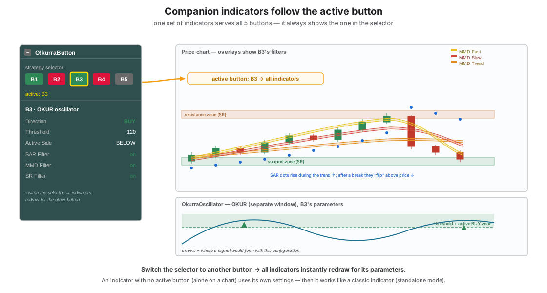
- Following the active button (the default mode when working with the panel). The indicator detects which button is currently active and shows its configuration. You switch the selector in OkurraButton to B3 → the indicators immediately redraw with B3’s parameters. This makes designing “live”: one indicator serves all five buttons, always showing the one you are working on right now.
- Standalone. When there is no active button to follow (e.g. you drop the indicator alone on a chart, without a panel), it uses its own settings — the period, threshold and filter parameters entered in its options. So you can also use it completely independently, as a classic indicator.
How the indicator recognizes the active button: OkurraButton stores the number of the active button in the platform’s shared memory, and the indicators read that number. When they find it — they follow. When the number is absent at indicator startup — they use their own settings (standalone mode). That is why companion indicators pulled in by OkurraButton (section 6.6) immediately “know” what to show.
The indicator reads the followed button’s parameters from the file B<N>_c<id>_applied.ini, which OkurraButton writes on Apply (<id> is the chart suffix, chapter 7; on the robot’s chart the indicator reads the copy published by the robot, section 6.7). The local indicators (OkurraOscillator, OkurraSAR, OkurraMMD, OkurraSR) have a field Source preference: … (Prefer_Applied, true by factory default) in their options. It is a leftover from older versions. Set to false it would make the indicator look first for the file B<N>_c<id>_snapshot.ini, and no O!kurra program writes that file any more — the indicator then reaches for the applied file anyway. So this field changes nothing.
A small caveat. If the active button number disappears mid-session (e.g. you remove the panel from the chart), only OkurraOscillator performs a full return to its own settings. The MMD / SAR / SR overlays then keep the last button configuration they were following — they fall back to their own settings only when no active button existed at their startup.
6.5 Per-button and global versions on one chart
Each of the three filters (SAR, MMD, SR) and the oscillator has a global version — one that reads not the configuration of a single button but the global filter designed in OkurraGlobal (the shared set the buttons subscribe to via opt-in — chapter 5.5).
Why two versions on one chart? Because in a real strategy a button often combines both contexts: it has its own local filter and at the same time subscribes to a global filter (e.g. a local SAR M5 as a fast gate + a global SAR M15 as the broader trend). With both the local and the global version on the chart, you see both at once:
- the local version shows what the active button sees,
- the global version shows the shared filter, regardless of which button is active.
To avoid confusion, the global versions have different colors and their own “space” on the chart — they coexist with the local versions without overlapping. The global versions are also clearly “filter visualization only” — they never generate signals, they show only the picture of the global filter saved by OkurraGlobal.
MMD cloud color cheat sheet — which set is which. The button’s local version (OkurraMMD): Fast cloud yellow, Slow red, Trend orange. The global version (OkurraGlobalMMD): Fast cloud light blue (Aqua), Slow blue (DeepSkyBlue), Trend green (SpringGreen). So if you see two sets of clouds on the chart: the yellow-red-orange set is the local filter of the active button, and the blue-green set is the global filter.
6.6 Auto-loading and cleanup
You do not have to drop these nine indicators on the chart manually — the panels do it for you:
- OkurraButton pulls in its four local versions (OkurraOscillator into the separate window, OkurraMMD/SAR/SR as overlays) — the auto-load switches in its settings are active by default. Pulling them in draws nothing yet — see “Zero state” below.
- OkurraGlobal can pull in five global versions (OkurraGlobalSAR/MMD/SR + OkurraGlobalOscillator + OkurraGlobalATR), but since panel 2.08 its five “Auto-load …” switches are off by factory default — a fresh panel adds nothing. Once you turn such a switch on in F7, the overlay still pulls itself in only when you enable “Show … On Chart” for it in the panel and confirm with Apply.
- When you remove a panel from the chart, the indicators that panel pulled in are removed together with it (separate switches, active by default), so they do not stay behind as “orphans” on the chart. An indicator you added by hand from the Navigator is not treated that way — the panel takes off only what it put on itself.
Zero state at startup — an empty chart until you enable something. A freshly dropped OkurraButton or OkurraGlobal draws nothing. This is deliberate:
- OkurraButton starts with no button selected (none of B1–B5 is active), and every button by default has all previews disabled (Show Oscillator / MMD / SAR / SR Box / Arrows On Chart = off). The picture appears only once you select a button and enable the previews you want (after Apply).
- OkurraGlobal starts with auto-loading off for all five global overlays (the “Auto-load …” switches in F7), and even once they are on it loads a given overlay only when the corresponding “Show … On Chart” is enabled (after Apply). When “Show … On Chart” is on and the chart stays empty, the panel writes into the Experts log which switch is holding it back.
- The EA also starts “clean”: visualization is turned on by clicking the name of the active strategy on the EA panel (chapter 8). A freshly attached EA draws no overlays.
Thanks to this a new chart stays clean and does not “flicker” with random overlays — you decide what to see and when.
You can of course also drop any indicator on a chart manually (by dragging it from the Navigator) — e.g. when you want to use it on its own (standalone mode, section 6.4) on a separate chart, without a panel.
Per-button visibility switch. Independently of auto-loading, each companion has its own per-button switch in OkurraButton: Show Oscillator On Chart, Show MMD On Chart, Show SAR On Chart, Show SR Box On Chart (plus Show Arrows On Chart for the arrows on the price chart). true → the overlay appears, false → it disappears. The change takes effect after Apply (like every button parameter change). This lets you decide, for each button separately, which overlays you want to see — e.g. only the oscillator and MMD, without SAR and SR.
Reset (“R”) also clears the picture, not just the settings. Reset in OkurraButton wipes not only the buttons’ values but also the visualization: it removes all overlays (MMD / SAR / SR), the arrows and the oscillator in the subwindow. The chart returns to the zero state — as after freshly dropping the panel, a convenient starting point for a new configuration. (Reset does not touch the save history or the EA itself — details in chapters 4 and 7.)
6.7 On the EA chart — the picture of the active strategy
The companion indicators are useful not only in design work but also when watching a running EA. On the chart with the robot you can have the same overlays — and then they show the configuration of the strategy you are currently viewing in the EA (the “active” one from the robot panel’s perspective).
The mechanism is the same as with the panel (section 6.4), except that the source of the “active button” is the EA, not OkurraButton: the robot publishes the configuration of the strategy currently being viewed into a dedicated space, and the indicators read it and draw it. Thanks to that, while watching a working basket, you can simultaneously see the filters and the oscillator of the strategy that generates those positions. The full description of controlling the indicators from the EA — chapter 20.
An important distinction. The fact that you see overlays on the EA chart does not mean the design panels are there — remember that OkurraButton/OkurraGlobal and the EA do not share a chart (chapter 2.7). On the EA chart the indicators are controlled by the robot itself, not by a design panel.
6.8 Practice
A few practical remarks to finish:
- Start with the oscillator. OkurraOscillator shows the heart of the strategy — where the threshold and the active zone fall. When designing a button for the first time, it will tell you fastest whether the oscillator “enters” the zone at all where you want it to.
- Add filters one at a time. Enable the SAR / MMD / SR overlays one by one, watching how each lays out on price and how it narrows down the places where a signal would have a chance to pass. All of them at once can crowd the chart.
- Enable the global version when you design global filters. If the buttons are to use the shared filters, keep the global version on the chart while tuning them in OkurraGlobal — then you immediately see where the global filter “gates”.
- A clean chart for structure. When you want to look at price alone (supports, resistances, patterns), remove the overlays or turn their display off — you will come back to them when you tune the strategy again.
- It is a tool of observation, not prediction. The signal arrows and zones show what the methodology sees with a given configuration — they do not foretell what the market will do next.
This concludes the overview of the design-mode tools. In the next chapter we close this part — saving and transferring configurations: how to turn a design into a .set file, how to manage it and how to load it into the EA — the bridge between design and execution in full detail.